THE SILLY SPOT
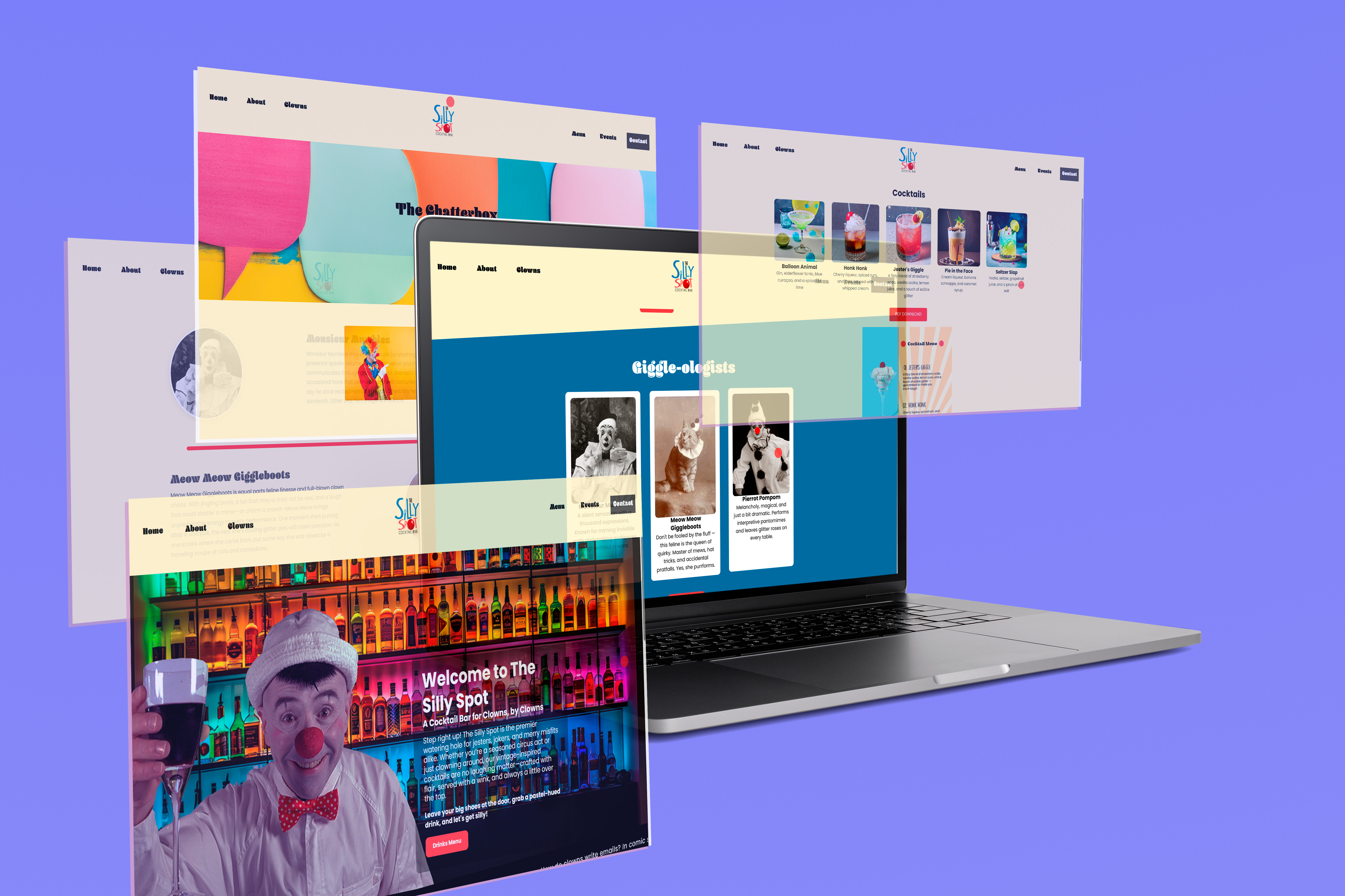
A playful, clown-themed bar concept that blends bold visuals with interactive design to create a fun digital experience. Built with HTML, CSS, and JavaScript, it brings personality and motion into a untypical bar website.
Client
Personal Project
Project
Web Design, Branding, and Development
Timeline
2025
Services
Graphic Design
Web Design
The Silly Spot was a playful branding and web design project centered around building a fictional clown-themed bar with personality, humor, and interactive charm. The goal was to create a digital experience that felt memorable from the first click, mixing bold visuals with lighthearted motion and custom details that made the site feel alive. I designed the project to be visually fun while still functioning like a fully considered website experience, balancing character-driven branding with usability and structure.
For this project, I developed the website in Visual Studio Code and exported it through GitHub, giving me full control over the layout, styling, and interactions through HTML and CSS. The site was built with responsive design in mind so it could adapt across screen sizes while keeping its playful identity intact. Alongside the coded website, I also created the logo design, menu design, and the overall visual direction for the brand, making sure every part of the experience felt connected.
What made the project especially fun was its interactive personality. I included cute hover-based elements, like a clown nose appearing on the bartenders when users moved over them, which helped bring humor into the browsing experience without overwhelming the design. The cursor itself was turned into a clown nose, adding another layer of immersion and making the site feel custom from the moment someone entered it. At the top of the page, I added an endless scrolling loop of clown jokes, which worked as both a visual feature and a playful storytelling device that reinforced the brand’s tone.
The project focused on creating a website that felt more like an experience than a static page. While the concept was silly by design, the execution still required thoughtful planning in layout, motion, hierarchy, and responsiveness. It became a strong example of how code, branding, and interaction design can work together to create something expressive, weird, and memorable in the best way.
Here's the link to the live version↗.