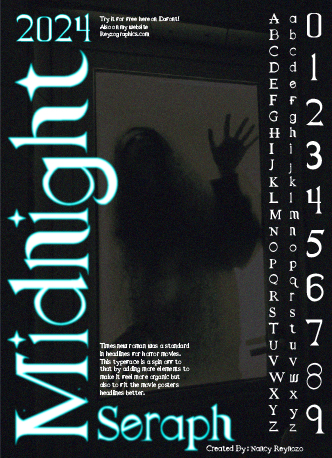
Midnight Seraph Font
A custom headline typeface based on research into horror movie typography, where Times New Roman was commonly used. This design keeps the familiar serif structure but pushes it into a darker, more unsettling direction.
Client
Personal Project
Project
Typography Design
Timeline
3 Weeks
Services
Graphic Design
This project explores how familiar typography can be reinterpreted through tone and context. Using Times New Roman as a foundation, I developed a display typeface inspired by horror film posters, where the typeface has historically been used to create tension through subtlety rather than distortion.
The typeface includes a full uppercase alphabet, numerals, and punctuation, designed specifically for headline use. The goal was to maintain readability while introducing unease through proportion, spacing, and contrast.
The final outcome is applied across aposter design to demonstrate how the typeface functions in a cinematic setting, emphasizing mood, hierarchy, and visual impact.